Viewing Compare Weather
This page addresses:
Viewing Outputs in the Form View
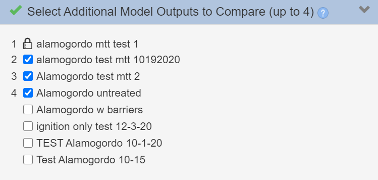
Once you have selected your model type and initial model output, use the checkboxes in the “Select Addition Model Outputs to Compare” step to select up to four weather scenarios to compare. Outputs are labeled by a number as you select them. You may check and uncheck any of the model outputs.
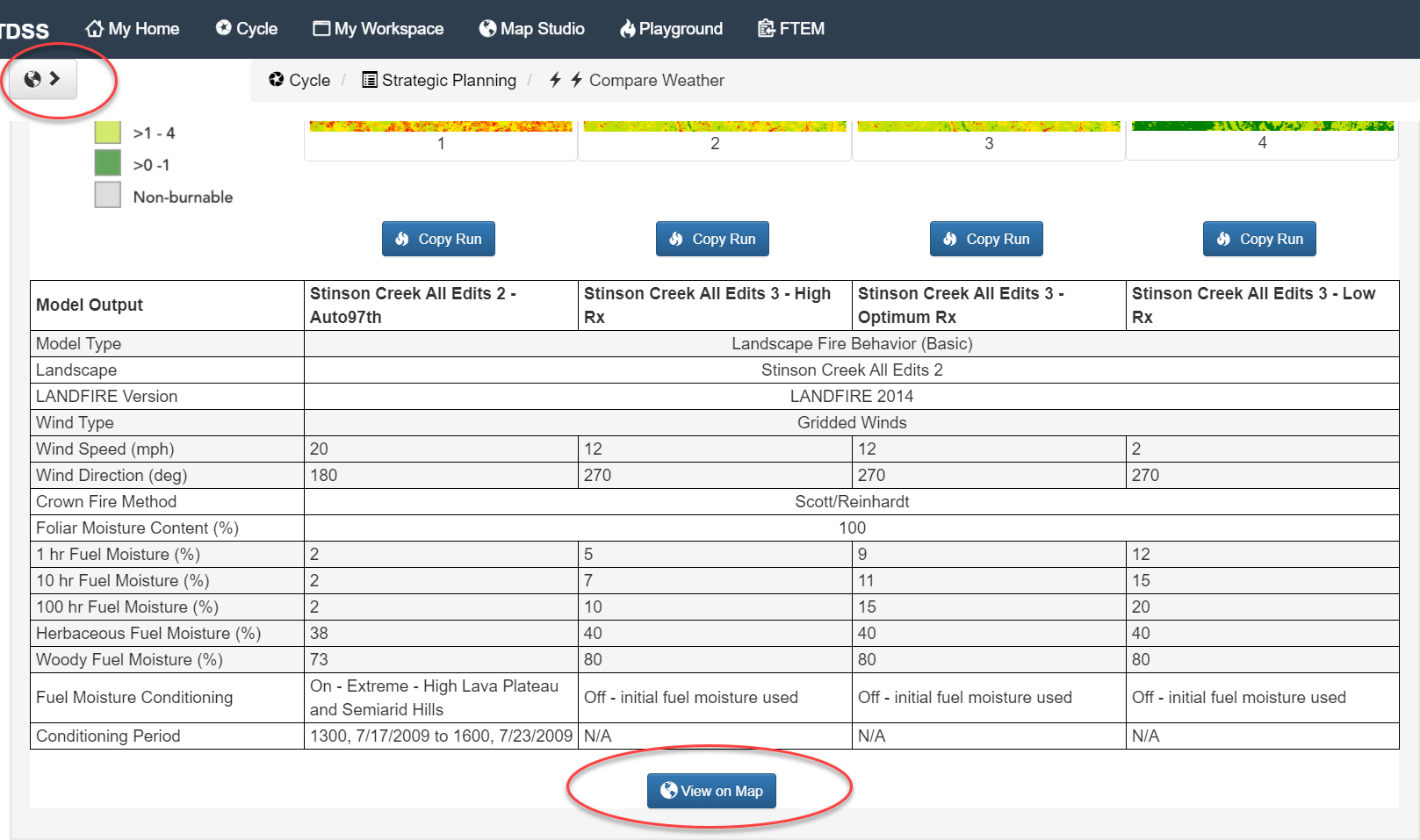
Model outputs and the features you select are displayed in the form view with thumbnails followed by a data table. All model outputs, aside from the first one indicated with a ![]() icon, may be moved up
icon, may be moved up ![]() or down
or down ![]() to change the order in which the selections are displayed. A model output may be removed from this list using the
to change the order in which the selections are displayed. A model output may be removed from this list using the  .
.
Viewing Outputs in Map Studio
Using the selection. You may view all model outputs and the selected output features in Map Studio using the Map View  button in the top left or the View on Map
  button at the bottom of the page.
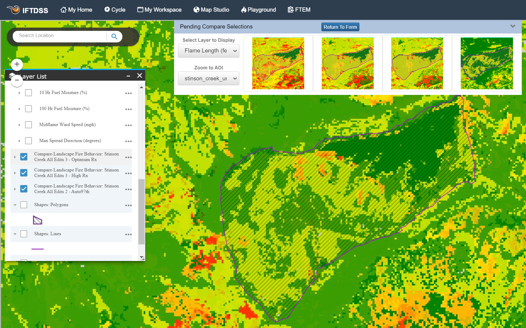
In Map Studio, you see each of model output sets turned on in Layer List, as well as a collapsible thumbnail view along the top. To navigate back to the form view, use the Map Studio  button in the top right, or the Return to Form
  button above the thumbnail view.
Clicking on the thumbnail image of each model output changes the Layer List and map features to that specific output.
Viewing Landscape Fire Behavior Outputs
Compare Weather displays all model outputs using the same extent. You can toggle outputs on and off, select which ones to display, or zoom to an Area of Interest within the form view. Selected outputs and zoom settings in the thumbnail display are retained in the thumbnail view when you navigate to the Map Studio using the Map View button in the top left or the View on Map button at the bottom of the page.
Viewing MTT Outputs
Compare Weather displays all model outputs using the same extent. In the case of MTT, where the extent of a modeled fire perimeter may differ across the outputs.
Viewing LBP Outputs
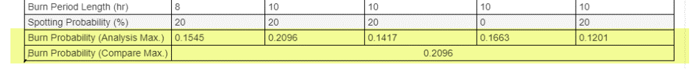
When comparing Landscape Burn Probability (LBP) outputs with Compare Weather, you will see the model outputs are binned based on the highest burn probability value in the set of LBP outputs.
In the bottom of the output comparison table, there are two rows to help you determine what you are looking at:
-
Burn Probability (Analysis Max.) This is the highest burn probability in a given model outputs. You will have one of these values for each output.
-
Burn Probability (Compare Max.) This the highest burn probability among all your outputs and it sets the binning for the comparison. You will have a single value across all outputs.
This same binning approach applies to the Integrated Hazard feature in LBP. For simplicity, we’ve explained the Burn Probability output here, but the principle is the same.
Why LBP is Compared This Way
Having an Analysis Max. and Compare Max. is necessary because burn probability (and integrated hazard) outputs are displayed dynamically. Specifically, they are dynamic based on the maximum value for a given Landscape Burn Probability model run (For details on dynamic display, see the “Display” sections in the Burn Probability and Integrated Hazard output topics).
The Burn Probability (Compare Max.) provides a single value that is used setting the display bins for these outputs, setting all the model run outputs to a single classification so you can visually compare across them. For example, the Highest (80-100%) of maximum class, red in IFTDSS, is the same for all five outputs. In other words, by using consistent binning across your comparison selections, you are truly comparing “apples to apples” when viewing LBP outputs in this compare workflow.
An Example
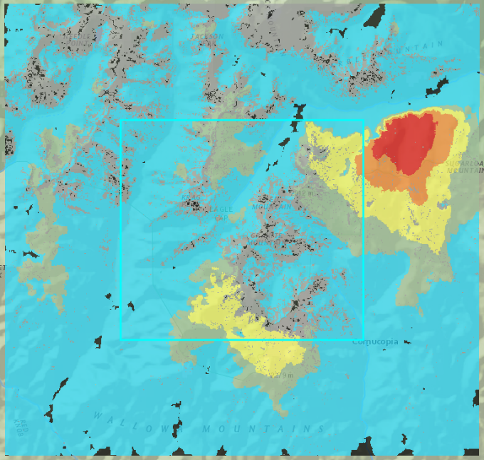
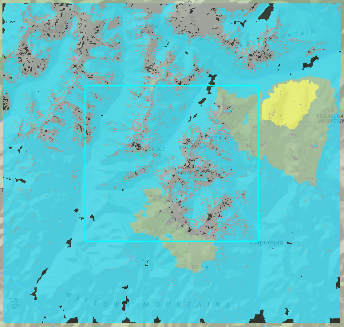
Below are visual examples of the Analysis Max. and Comparison Max. displayed for two model outputs listed in the table screen shot above. In each set of images, the left image shows model outputs for the fifth row in the table (Burn Probability Analysis Max. of 0.1201), and the image to the right shows the second row displayed in the table (Burn Probability Analysis Max. of 0.2096).
In the first image set, each model output is binned and displayed using its Analysis Max. burn probability (0.1201 and 0.2096). Note the areas of high and highest burn probability appear to be relatively similar.
Analysis Max
|

|
|
Lowest, >0 - 0.024 Lower, 0.024 - 0.048 Middle, 0.048 - 0.0721 Higher, 0.0721 - 0.0961 Highest, 0.0961 - 0.1201 |
Lowest, >0 - 0.0419 Lower, 0.0419 - 0.0838 Middle, 0.0838 - 0.1258 Higher, 0.1258 - 0.1677 Highest, 0.1677 - 0.2096 |
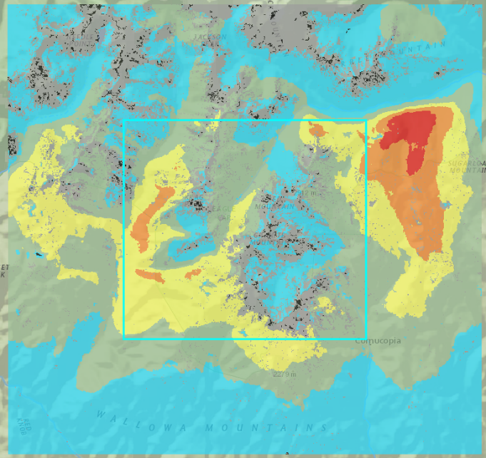
Comparison Max
|
|
|
Lowest, >0 - 0.0419 Lower, 0.0419 - 0.0838 Middle, 0.0838 - 0.1258 Higher, 0.1258 - 0.1677 Highest, 0.1677 - 0.2096 |
|
In this second image set, both model outputs are binned and displayed using the Compare Max. (0.2096). By binning both outputs with the same maximum value (Compare Max.) it allows you to make a direct visual assessment of how the two compare. Because the Burn Probability Analysis Max. is a lot lower in the image on the left, there are no “Higher” or “Highest” class burn probability areas when mapped using Burn Probability Compare Max. By binning and displaying both outputs with Burn Probability Compare Max., we can tell that the image to the right has relatively higher areas of burn probability. Had we used the Analysis Max, as displayed in the top image, both outputs would look more similar and this difference would be harder to detect.